Lomochrome Purple 120 Film on the Mamiya 645 Pro – Finding Beauty in Unusual Colours
Roll 05 – Exploring Lomography’s colour-shifting film in Devon woodland, with delicate pink foliage, unusual textures and a few surprises.
Why I wanted to try Lomochrome Purple
Lomography’s LomoChrome Purple is one of those films that immediately attracts attention. Its ability to transform familiar colours into shades of purple, pink and magenta makes it rather different from conventional colour negative film.
But I wasn’t particularly interested in simply producing purple landscapes.
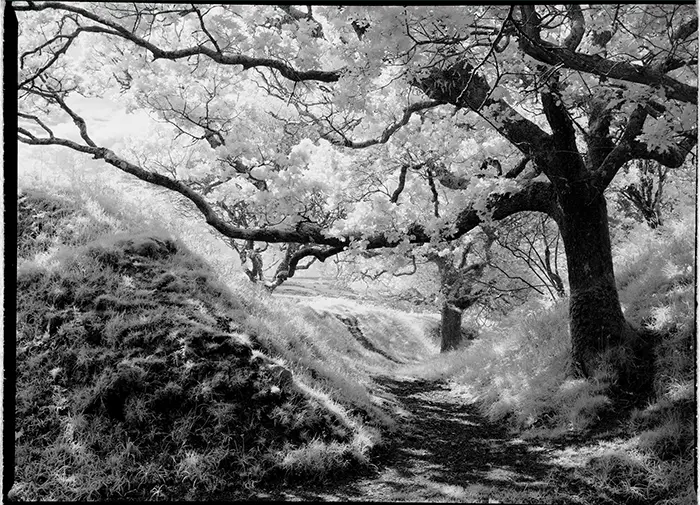
Having recently experimented with Rollei Infrared 400, I’d discovered that unusual film stocks can be far more interesting when paired with subjects that complement their characteristics.
With infrared film, I found myself moving away from the familiar glowing white trees and almost black skies. Instead, I started looking for woodland scenes where the shapes, textures and unusual tonal relationships created something a little more delicate.
Some of those photographs reminded me of Japanese paintings.
I wondered whether LomoChrome Purple could produce something similarly interesting.
I’d also seen comparisons between LomoChrome Purple and the discontinued Kodak Aerochrome infrared colour film. Although LomoChrome Purple isn’t infrared-sensitive in the same way, its pink and magenta foliage can sometimes produce a vaguely similar appearance.
That was certainly part of its appeal.
The challenge was finding subjects where those unusual colours would enhance the photograph rather than simply become a novelty.
The camera and film
For this experiment, I used my Mamiya 645 Pro medium format camera loaded with a roll of LomoChrome Purple 120 film.
Lomography recommends shooting the film between ISO 100 and 400, with different exposure settings influencing the colour shifts and overall appearance.
I decided to rate the film at ISO 200.
My thinking was that shooting towards the middle of its recommended range might produce slightly more restrained colours than some of the more extreme examples I’d seen online.
I also bracketed a few frames, exposing one stop above and below my chosen setting, to see how much difference exposure would make.
No filters were used.
I wanted to understand how the film responded to the available light before introducing additional variables such as a polarising filter.
The weather was overcast and dry, with occasional suggestions that the sun might break through the cloud.
Not particularly dramatic conditions, but potentially useful for the softer, more delicate photographs I was hoping to make.
Blagdon Rings – returning to a familiar subject
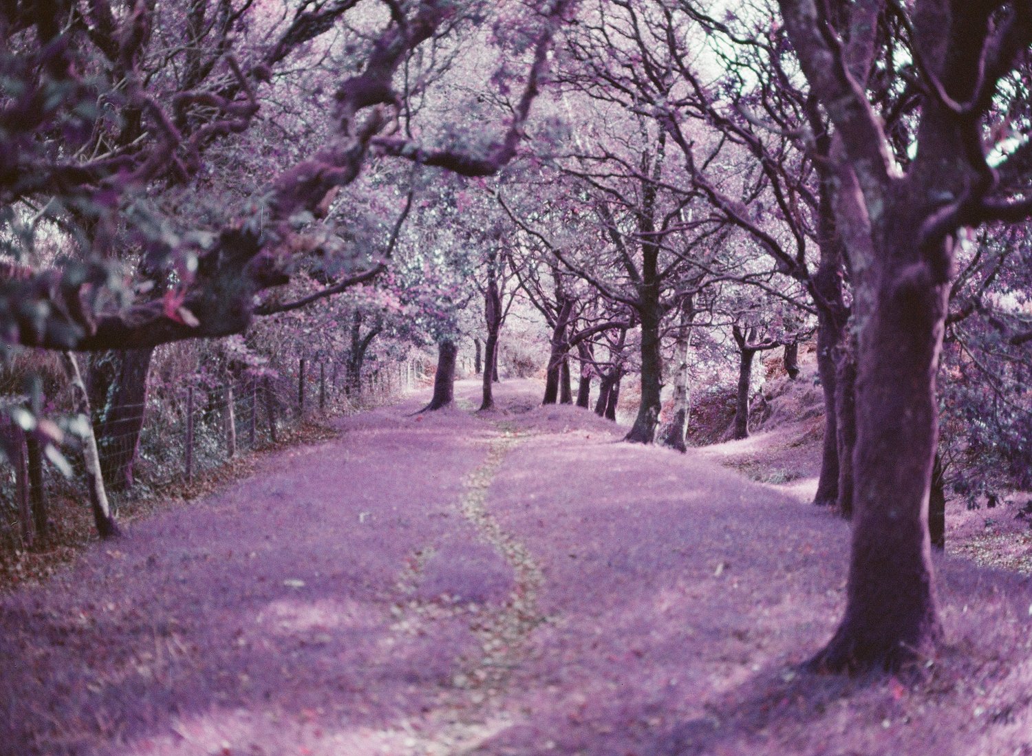
I chose Blagdon Rings in Devon for the first part of the roll.
It’s a location I know reasonably well, with interesting woodland, plenty of textures and the added advantage of being a good place to walk the dog.
It’s also only a short walk from the car park, which makes it particularly convenient when experimenting with different photographic ideas.
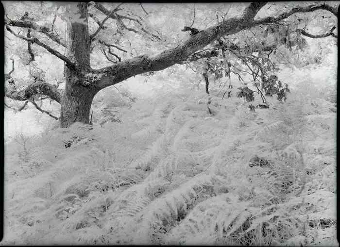
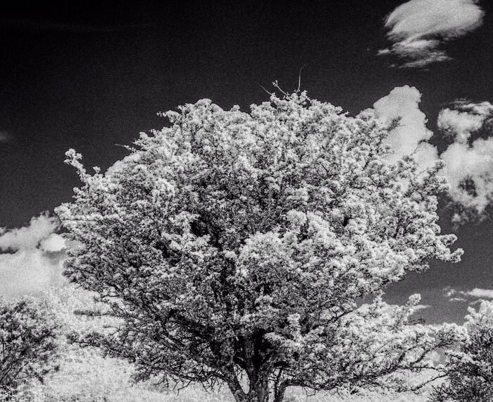
More importantly, there’s a tree here that I’d previously photographed using Rollei Infrared 400.
That photograph became one of my favourites from my infrared experiments, and I was curious to see how the same subject would look on LomoChrome Purple.
I didn’t spend a great deal of time reinventing the composition. In fact, I largely repeated the framing I’d used for the infrared photograph.
Perhaps a little lazy, but it provided an interesting comparison between two very different film stocks.
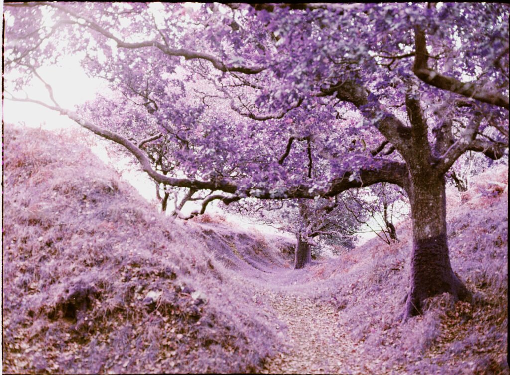
The result worked well.
The foliage took on unusual colours, and the tree retained something of the painterly character that had originally attracted me to the subject.
However, I still prefer the infrared version.
I think that’s an important part of experimenting with unusual films. Just because a subject works well with one film doesn’t necessarily mean another will improve upon it.
Sometimes a different film simply produces a different interpretation, and that’s perfectly fine.
My favourite frame – pink leaves and a creamy grey sky
The photograph that really surprised me came from a group of trees elsewhere in the woodland.
Initially, I wasn’t particularly enthusiastic about the scene.
In fact, I remember thinking that I wished I’d brought a roll of Kodak Portra. The natural colours looked attractive, and I could imagine how well they might have rendered on a conventional colour negative film.
But I started looking more closely.
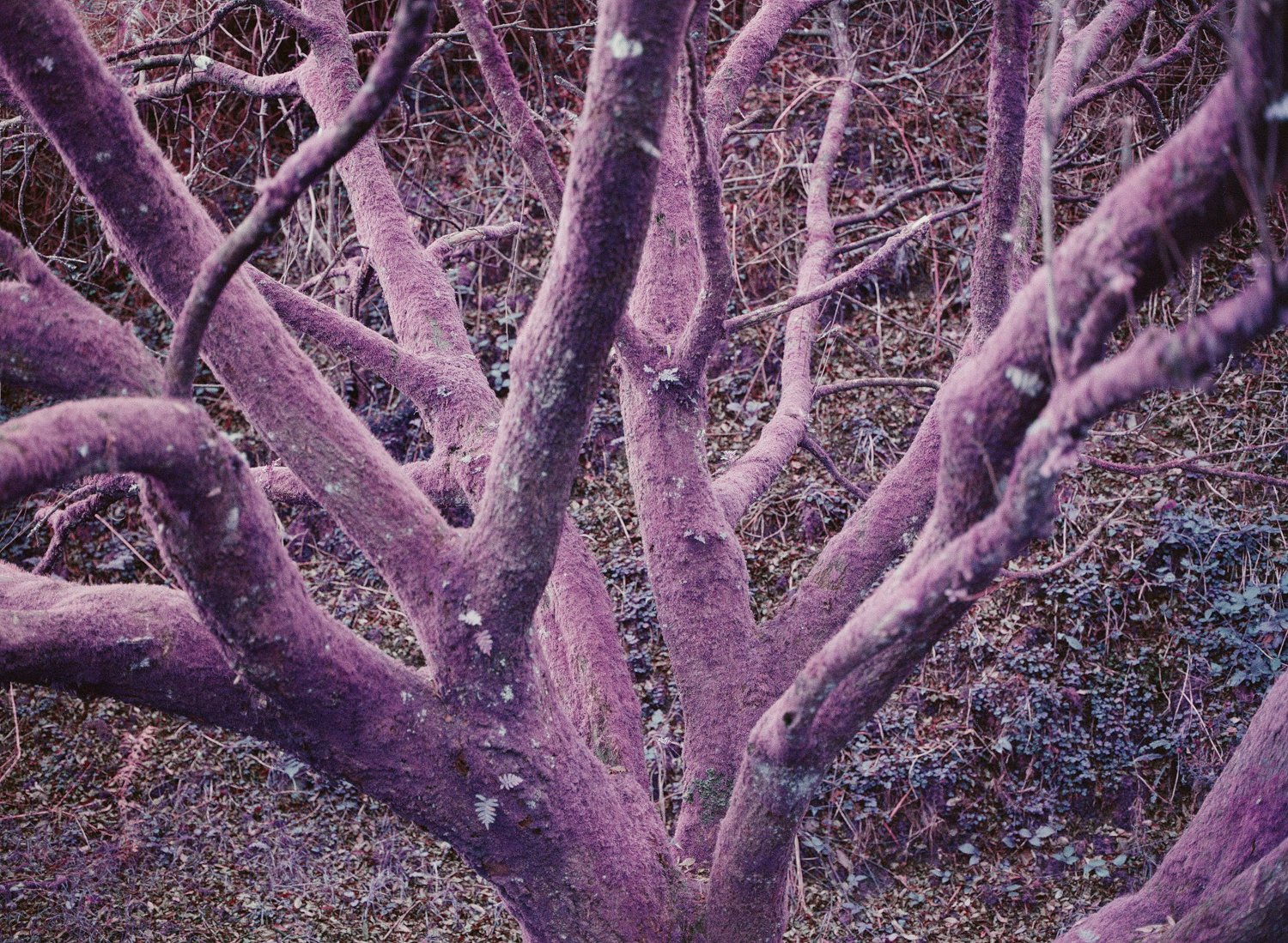
Instead of photographing the trees as a group, I concentrated on individual branches, the shapes they formed and the subtle variations in the leaves.
There were some wonderfully gnarly branches, with delicate foliage set against a pale, overcast sky.
I wasn’t entirely sure how LomoChrome Purple would interpret the scene.
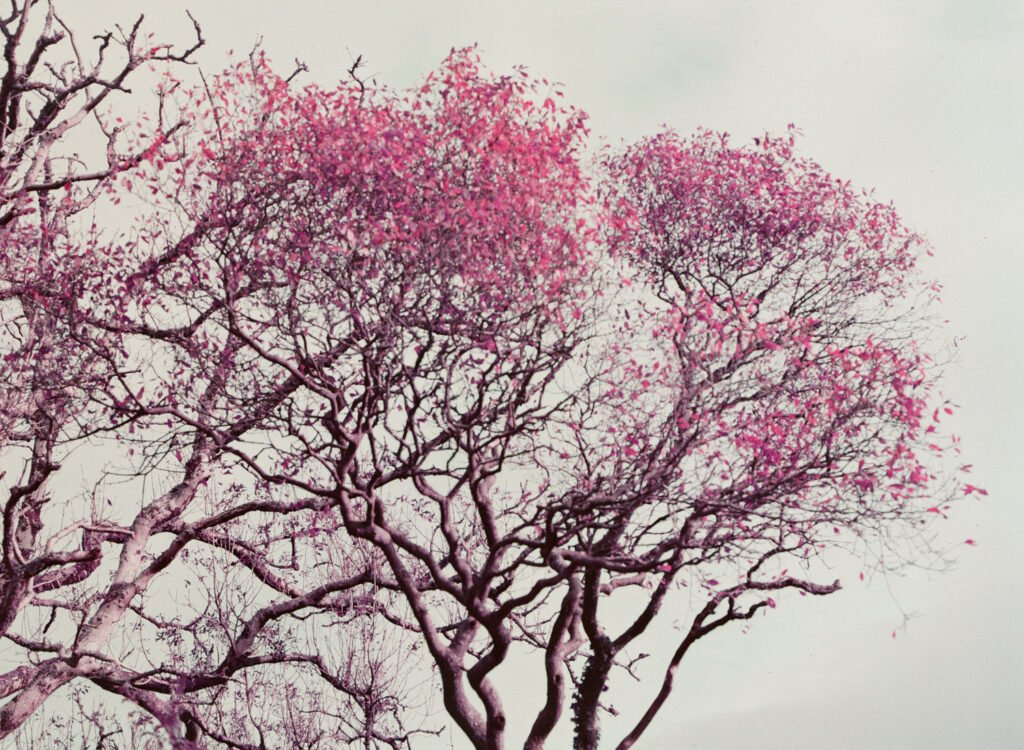
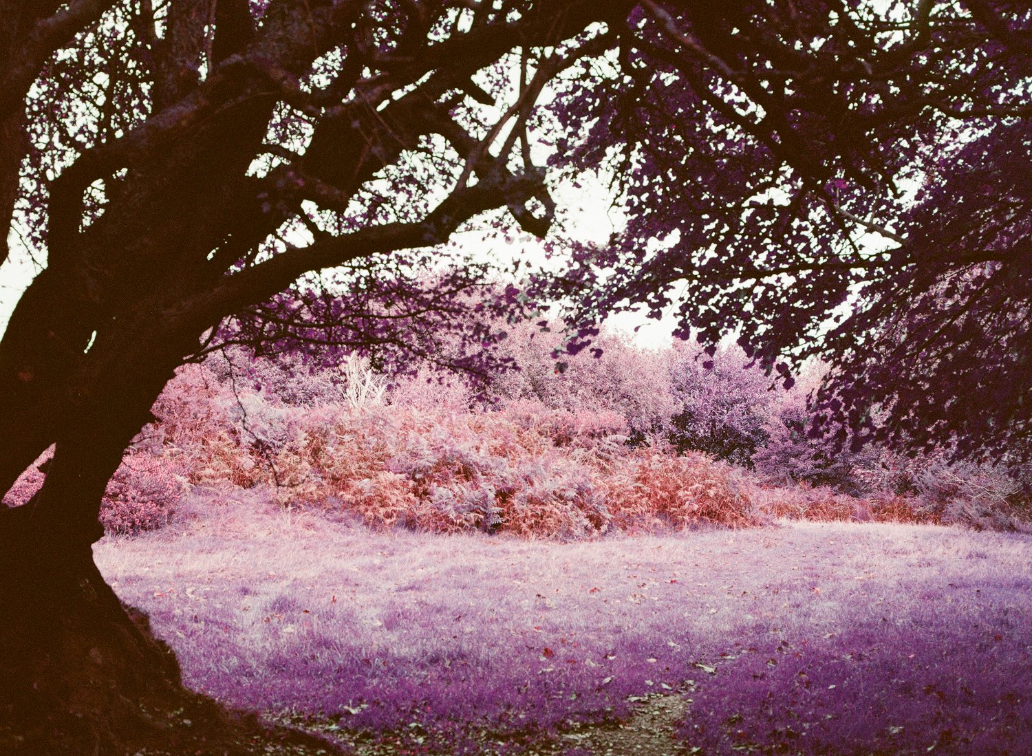
When I received the developed film, this photograph immediately stood out.
The leaves had become a delicate pink-magenta, while the sky had taken on a soft, creamy grey appearance.
It was exactly the sort of result I’d hoped this film might produce.
There was something almost Japanese about the simplicity of the composition, with the branches providing structure and the unusual colours creating a gentle, painterly quality.
It also reminded me of Kodak Aerochrome.
That similarity wasn’t entirely unexpected, as it had been one of the reasons I’d wanted to try the film in the first place.
What I particularly liked was that the photograph didn’t feel overwhelmed by the colour shift.
The unusual colours contributed to the image rather than becoming its sole attraction.
For me, this was easily the strongest photograph on the roll.
Experimenting beside the river
I also used some of the roll to photograph the river near my home, literally about twenty seconds from my doorstep.
This provided a different environment from the woodland at Blagdon Rings, with water, reflections and overhanging vegetation.
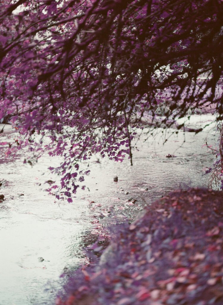
The results were interesting, although I don’t think I’ve quite worked out how best to use LomoChrome Purple in this setting.
There are possibilities with reflections, different compositions and the way foliage interacts with the water that deserve further exploration.
Some of the photographs suggested ideas that I hadn’t considered when taking them.
I suspect that experimenting with different lighting conditions and getting closer to particular details could produce something rather special.
These aren’t photographs I’d describe as failures. They’re more like the beginning of another experiment.
Developing and scanning Lomochrome Purple
I had the film professionally developed and scanned before making my own scans at home.
For home scanning, I use my Fujifilm GFX100S II with a macro lens and film holder, converting the negatives using Negative Lab Pro and Lightroom Classic.
Normally, I prefer my own scans to those supplied by the lab.
However, LomoChrome Purple has proved particularly challenging when it comes to colour conversion.
The film’s unusual colour relationships mean that relatively small adjustments can produce quite significant changes in the final image.
The balance between the pinks, magentas, purples and neutral tones is surprisingly delicate.
In particular, I found it difficult to reproduce the lovely creamy grey sky and soft pink foliage that appeared in the lab’s scans.
After quite a bit of experimentation with Negative Lab Pro and Lightroom’s individual colour-channel curves, I’ve managed to get much closer.
But on this occasion, I still think the lab produced the better colours.
That’s slightly frustrating, especially when you’ve invested time in developing your own scanning workflow, but it’s also part of the learning process.
I’m not interested in forcing the colours into something completely different from what the film naturally produces.
I’d rather understand the conversion process and work towards a result that respects the character of the original negative.
What did shooting at ISO 200 teach me?
I chose ISO 200 because I hoped it would produce colours that were unusual without becoming too overwhelming.
Looking at the results, I’m pleased with that decision.
Some of the photographs have quite pronounced colour shifts, while others are much more subtle.
The delicate pink leaves against the creamy grey sky are a good example of the latter.
I did bracket a few photographs by one stop either side, and the results have given me something to consider for future rolls.
However, I wouldn’t want to draw sweeping conclusions about the best ISO setting from a single roll.
The subject, lighting conditions and colour conversion all influence the final appearance.
For now, ISO 200 seems a sensible starting point for the type of photographs I want to make.
No failures, but plenty to learn
One of the most encouraging things about this first roll was that I didn’t consider any of the photographs complete failures.
Some worked considerably better than others, but even the less successful frames offered something interesting.
The Japanese tree produced a pleasing result, although I still favour the infrared photograph.
The riverside images suggested possibilities for further experiments with reflections and vegetation.
And the photograph of the pink-magenta leaves against the grey sky exceeded my expectations.
What I enjoyed most was the way the film encouraged me to look at familiar subjects differently.
Rather than searching for dramatic landscapes, I found myself concentrating on shapes, textures and small variations in foliage.
It reminded me that sometimes the most interesting photograph isn’t the wider scene, but a small detail within it.
Will I shoot Lomochrome Purple again?
Definitely.
I’m hoping to use another roll during an upcoming photography workshop on Dartmoor, where I’ll have an opportunity to explore different subjects and perhaps different lighting conditions.
I’m particularly interested in finding scenes where the unusual colours work with the composition rather than dominating it.
Water, reflections, interesting foliage and more intimate landscapes all seem worth investigating.
I’m also keen to continue experimenting with scanning and colour conversion until I can reproduce the film’s more delicate colours consistently.
After just one roll, I certainly wouldn’t claim to have mastered LomoChrome Purple.
But I think I’ve begun to understand what attracts me to it.
It’s not simply the novelty of turning green foliage purple.
It’s the possibility of discovering something unexpected in an otherwise familiar subject.
And for me, that’s a good enough reason to load another roll into the Mamiya 645 Pro.

Leave a Reply